This post is about visualizing confidence intervals. Matplotlib has some really neat capabilities that are useful in that regard, but before we get into the pictures, here’s a short digression on statistics.
I like resampling-based statistics a lot, as an engineer their practicality and intuitiveness appeals to me. It has been shown that students learn better and enjoy statistics more when they are taught using resampling methods. Here’s a nice description of the motivation for resampling (ok, maybe it's a bit over the top):
For more than a century the inherent difficulty of formula-based inferential statistics has baffled scientists, induced errors in research, and caused million of students to hate the subject.Complexity is the disease. Resampling (drawing repeated samples from the given data, or population suggested by the data) is a proven cure. Bootstrap, permutation, and other computer-intensive procedures have revolutionized statistics. Resampling is now the method of choice for confidence limits, hypothesis tests, and other everyday inferential problems.
In place of the formidable formulas and mysterious tables of parametric and non-parametric tests based on complicated mathematics and arcane approximations, the basic resampling tools are simulations, created especially for the task at hand by practitioners who completely understand what they are doing and why they are doing it. Resampling lets you analyze most sorts of data, even those that cannot be analyzed with formulas.
One of the useful things to do is resampling of residuals. The assumptions underlying most models are that the magnitude and sign of the residuals are not a function of the independent variable. This is the hypothesis which we’ll base our resampling on. First we fit a model (a line in these examples) to some data, then calculate all the residuals (difference between the data and the model). Then we can apply a couple of different resampling approaches towards understanding the confidence intervals.
A permutation-based way of establishing confidence intervals is easily accomplished in Python using the itertools module’s permutation function. This is an exact method, but the number of permutations grows as the factorial of the sample size. The six-sample example shown in figure 1 has 6! = 720 possible permutations of the residuals. With only ten samples the number of permutations grows to 3628800 (over three million). The point of this post is visualization, so plotting three million lines may not be worth our while.
Figure 1 shows the least-squares-fit line in solid black, with the lines fit using the permuted residuals slightly transparent. Here’s the Python to accomplish that:
nx = 6
x = sp.linspace(0.0, 1.0, nx)
data = x + norm.rvs(loc=0.0, scale=0.1, size=nx)
yp = sp.polyfit(x, data, 1)
y = sp.polyval(yp,x)
r = data - y
nperm = factorial(nx)
for perm in permutations(r,nx): # loop over all the permutations of the resids
pc = sp.polyfit(x, y + perm, 1)
p.plot(x, sp.polyval(pc,x), ’k-’, linewidth=2, alpha=2.0/float(nperm))
p.plot(x, y, ’k-’)
p.plot(x, data, ’ko’)
We’ve used the alpha argument to set the level of transparency in each of the permutations. Where more of the lines overlap, the color is darker. This gives a somewhat intuitive display of the ’weight’ of the variation in the model fit (confidence).
As mentioned above, doing exact permutation-based statistics becomes computationally prohibitive rather quickly, so we have to go to the random-sampling based approximations. The bootstrap is one such approach.
Rather than generating all possible permutations of the residuals, the bootstrap method involves drawing random samples (with replacement) from the residuals. This is done in Python easily enough by using the random_integer function to index into our array of residuals.
nboot = 400
for i in xrange(nboot): # loop over n bootstrap samples from the resids
pc = sp.polyfit(x, y + r[bootindex(0, len(r)-1, len(r))], 1)
p.plot(x, sp.polyval(pc,x), ’k-’, linewidth=2, alpha=3.0/float(nboot))
p.plot(x, y, ’k-’)
p.plot(x, data, ’ko’)
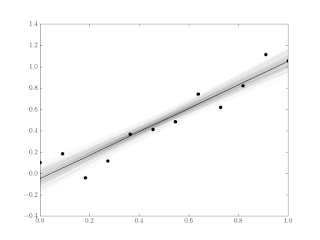
Figure 2 shows the method applied to the same six data points as with the permutation.
Since the sampling in the bootstrap approach is with replacement we can get sets of residuals that have repeated values. This tends to introduce a bit of bias in the direction of that repeated residual. You can see that behaviour exhibited in Figure 2 by the spreading of the lines around the middle of the graph, in contrast to the tight intersection in the middle of Figure 1.
Of course the reason the bootstrap method is useful is we often have large samples that are impractical to do with permutations. The Python to generate the 12-sample example in Figure 3 is shown below.
nx = 12
x = sp.linspace(0.0, 1.0, nx)
data = x + norm.rvs(loc=0.0, scale=0.1, size=nx)
yp = sp.polyfit(x, data, 1)
y = sp.polyval(yp,x)
r = data - y
p.figure()
for i in xrange(nboot): # loop over n bootstrap samples from the resids
pc = sp.polyfit(x, y + r[bootindex(0, len(r)-1, len(r))], 1)
p.plot(x, sp.polyval(pc,x), ’k-’, linewidth=2, alpha=3.0/float(nboot))
p.plot(x, y, ’k-’)
p.plot(x, data, ’ko’)
These sorts of graphs probably won’t replace the standard sorts of confidence intervals (see the graph in this post for example), but it’s a kind of neat way of looking at things, and a good demo of some of the cool stuff you can do really easily in Python with Matplotlib and Scipy.


No comments:
Post a Comment