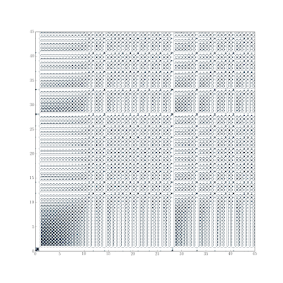
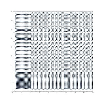
In the previous post in the Lorenz63 series we used recurrence plots to get a qualitative feel for the type of behavior exhibited by a time series (stochastic, periodic, chaotic). Those were using the default colormap in matplotlib, and they seem to highlight the “holes” more than the “near returns” (at least to my eye). Here’s some improved ones that use the bone colormap and a threshold on the distance to better highlight the near returns.


Interesting stuff from the Lorentz Center on Physics of Mixing.
ReplyDelete